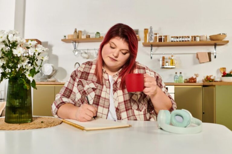
Coloring for mindfulness is about intention. There aren’t strict rules, but every choice matters, even your palette. A common mistake for beginners is grabbing every pencil in the box and filling the page with noise. When the aim is calm, less is more. In this post, we’ll look at simple color psychology, easy ways to build a soothing palette, and the best colors for relaxation so you can settle your mind without overthinking it. In this friendly guide of small, steady habits, I’ll share beginner palettes, quick swaps if you’re tense, and gentle steps to test what works for you. If you’ve ever asked, “Which colors for relaxation actually help me feel at ease?” you’re in the right place.
Some links in this post are affiliate links. This means I may earn a small commission — at no extra cost to you — if you purchase through these links. Thank you for supporting this blog and helping me continue creating free content. See Disclaimer.
The Science of Color Psychology
I’m not kidding when I say there are colors for relaxation. We don’t just see color we also feel it, and research backs that up. Valdez and Mehrabian (1994) found that brightness and saturation change our mood: brighter colors tend to feel more pleasant, while lower saturation (softer, grayer tones) lowers arousal. In real rooms, Küller et al. (2006) reported that blue–green environments were linked with calmer moods, while strong reds pushed tension higher. Other work shows similar patterns. Mehta and Zhu (2009) found blue settings support relaxed, open thinking, while red cues alertness and caution. And large cross-cultural studies (Jonauskaite et al., 2019) show people around the world often link blue and green with calm, and red with excitement or stress.
So what does this mean for colors for relaxation? Aim for cooler hues, keep saturation low, and use lighter to mid values. These small choices calm the nervous system, reduce visual “noise,” and make mindful coloring feel steady and soothing.
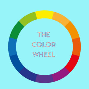
The Color Wheel and Colors for Relaxation
When you pick colors with a plan, your page feels calmer right away. A little color theory gives you that plan without any fuss. Here are the basics and how to use them for a soothing palette.
- Hue: This is the actual color. Think blue, green, red.
- Saturation: How strong or dull a color is. Does it stand out on the page or fade into the background?
- Value: How light or dark a color is. This is easy: is the color closer to white or black on the brightness scale?
How Color Affects Calm…
- Hue is the color itself, and research shows that cool tones like blue support relaxation and thinking.
- Low Saturation lowers arousal. So if you are feeling excited or worked up, then pick a dull color to find and settle your mind.
- Finally, Value or Brightness. While dull colors offer calm, brighter ones can make you feel happy or content.
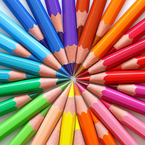
Common Coloring Mistake: A Busy Palette
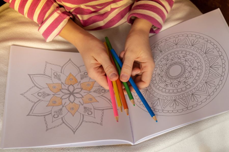
In this Beginner’s Guide to Mindful Coloring, you can find the most common mistakes that beginners make. A big one is their color palette. It’s so easy to grab every pretty color and use them all. Ever wonder why the page feels loud and jumpy? Too many hues (colors) create visual chaos and cause decision fatigue. Your eyes can’t settle, then your mind won’t be able to settle either.
The Fix? A Limited Palette.
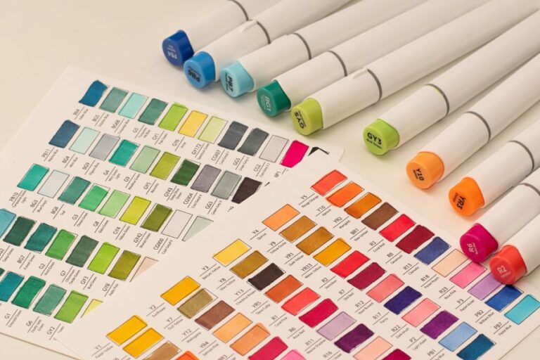
For beginners, I recommend using 3 colors in total. A Base color, a support color, and one accent color for a little detail. Read this small guide on how to pick colors that go together with ease.
A test to see if you like your chosen palette: Swatches. In a clean space on your page, color small boxes of your palette next to each other. If the test feels soothing, you are on the right path and can get coloring. If not, then make some changes. Choose a color with a different hue of value to quiet the page.

The BEST Colors for Relaxation
Want your coloring time to feel like a deep breath? Start with colors that lower visual energy. Cool, muted tones and a soft neutral calm the eye and help your mind settle. Here are five easy picks and why they work.
Dusty Blue

HEX Code: #8FA9C9
This muted blue echoes sky and calm water, which signals safety and steady rhythm to the brain. Its soft, gray undertone lowers visual noise, so big areas feel open and easy. Use it as your main base to set a peaceful tone.
Sage Green

HEX Code: #A3B18A
Sage has a higher value that leans toward gray, which takes the edge off green and makes it restful. It reminds us of leaves and herbs, so it feels fresh, stable, and healing. Great for backgrounds and foliage when you want nature’s calm without bright energy.
Misty Teal

HEX Code: #7FB7BE
Teal blends blue’s calm with green’s balance. In a misty, muted version, it suggests quiet water and gentle depth. That slight gray keeps it from shouting. Use it to link areas, add soft contrast, and keep the scene flowing.
Soft Lavender

HEX Code: #C8C3E6
Teal blends blue’s calm with green’s balance. In a misty, muted version, it suggests quiet water and gentle depth. That slight gray keeps it from shouting. Use it to link areas, add soft contrast, and keep the scene flowing.
Warm Gray (Greige)

HEX Code: #C8C2B8
Greige sits between gray and beige, so it calms while staying cozy. It lowers harsh contrast and gives the eye places to rest. Use it as a backgroundcolor, for borders, or to soften bright spots. It makes other colors feel gentle and unified.
Create the Perfect Palette of Colors for Relaxation
You can create a relaxing color palette for your next mindful coloring session in 4 simple steps. Here’s your repeatable guide to a soothing limited palette.
Step One: Commit to 3 Colors
Don’t overwhelm yourself. Only choose three colors for your limited palette. Want a little more variety? Okay, choose up to five colors. But remember, too many colors will add to your decision fatigue, and that’s the opposite of how you want to feel.
Step Two: Assign Roles
Believe it or not, assigning roles to your colors at the beginning makes mindful coloring easier. A Base or Main color is going to be your calm workhorse. It will make up about 60-70% of your coloring page. Next is the Support. It is a soft neighbor to your base and gives your eyes something new to look at, but still calming. Finally, choose an Accent. This will only take up 5-10% of the page, but it can offer a tiny pop of contrast to the rest of your coloring session.
Step Three: Test Your Palette
You might not get it right on the first try. Sometimes, your color palette will actually feel overwhelming instead of soothing. That’s not what we want. So before spending 15 minutes creating chaos and feeling anxious, make a swatch test of your chosen color palette. It’s a small test to gauge the effects of your colors.
Step Four: Lock In + Color
Take your mini swatch card with its ratios and start coloring. Start pages with the base on big shapes, weave the support through, and save the accent for last, tiny touches. Repeat colors across areas to keep everything calm and connected.

Choosing the Right Coloring Page for Relaxation
The page you pick shapes your whole experience just like your color palette. Calm comes easier when the design lowers decision fatigue and gives your eyes a steady rhythm to follow.
What to Look for…
- Moderate detail: clear shapes you can fill without squinting.
- Even line weight + clean boundaries: less second‑guessing, smoother flow.
- Repetition and symmetry: patterns your brain can predict.
- Breathing space: some open areas so the page doesn’t feel crowded.
Geometric Coloring Pages
A palette of colors for relaxation is best used with a coloring page for calm. The perfect choice for beginners is Geometric Coloring Pages. Geometric patterns offer built‑in mindfulness. Their repeatable shapes create a gentle cadence—perfect for “one shape per breath” or coloring in slow, even batches. Symmetry balances your gaze, repetition reduces mental chatter, and clear edges make it easy to use a limited palette with simple ratios. Start with tessellations, isometric cubes, or wave lattices. On edgy days, pick larger tiles; for focused days, try finer grids. If you’re browsing, geometric patterned coloring pages are a reliable, calming choice.
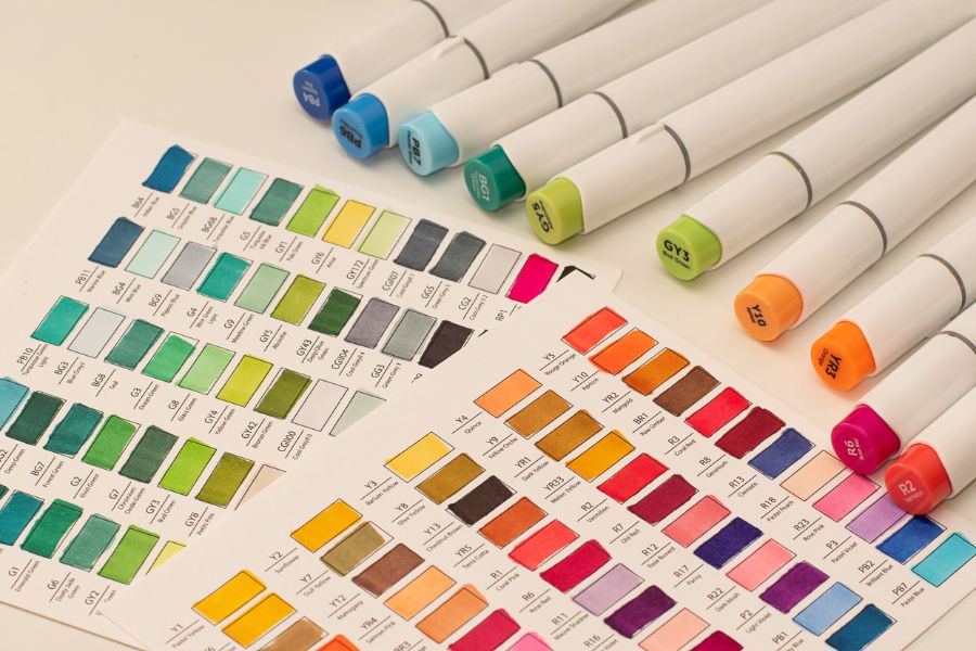
Tools + Resources for Mindful Coloring
Think of these tools as quiet companions, not must-haves. A tiny bit of structure makes coloring calmer and easier to start, whether you’re sneaking five minutes between emails, unwinding on the couch, or coloring on a flight. Below are lightweight helpers I actually use: printables to corral your colors, soft pencils/markers that blend without fuss, simple palette apps, and low-stimulus audio to set the pace.
- Printable Swatch Cards: Keep a tiny swatch card in your pencil pouch to help you test your palettes.
- Blendable Pencils: Look for “soft core” colored pencils that layer without scratching. Think buttery pencils for quiet blending at the kitchen table.
- Palette Pick Sites: Get color palettes made for you with a color picker site like Coolors.
- Lo-Fi Audio: A gentle lo-fi or piano playlist, soft rain, or forest sounds help you slow your strokes. Here’s the link to my favorite Lo-Fi YouTube Channel.
Links to Helpful Tools
What’s Next After Finding the BEST Colors for Relaxation?
Start coloring! Mindfulness is something you do, not just read about. Now that you know how to mindfully color and what colors to use, it is time to start coloring.
Try one small step today and build from there. Here’s what to do next:
- How to Color Mandala Pages: learn to place your 3–5 colors ring by ring, from base to accent, so the pattern feels balanced.
- Free Positivity Coloring Pages: print a page, grab your swatch card, and test a soothing palette without pressure.
- Creative Art Exercises for Peace: short, color-friendly prompts you can finish in 10–15 minutes, great for breaks or bedtime wind-down.
- Visit the Mindful Art Hub (Coming Soon!): find printable swatch cards, simple palette guides, and mindful supplies I recommend.
Bookmark the ones that speak to you, and start with five minutes. Repeat your colors, breathe with the shapes, and let the page set the pace. You’ve got this.